.
The re-imagining of data / scientific, academic or other relevant material (personally interesting, but non personal in content), it's organisation, indexing and professional presentation. What is success? what constitutes failure? how do you graphically categorise accidents? and can risk become a 'pythonesque' catalogue of bizarre illustrations?
Monday, 5 March 2012
Proof printing | research
As a designer its essential that proofs are made before getting final prints done. proof printing has been essential in my research to show people that have not seen it before to comment on the design and function of my work. By doing this it has enabled me to change specific elements in my work in order to make them better.
proof printing is very important and is the key to getting precise work that is easy to read. One thing I have noticed is that as a designer, looking at something on a screen all the time can often look different to when printed, and its always better to look at something that is physical, to gain an understanding of how it functions physically. you can always pick out mistakes by having proof prints.
Essential learning!!!
Website
The website is a platform for the entire collection of cropped circle merchandise, game, and contact details. The website is made up of 4 simple pages, Home page, Our collection, Our Game and Contact.
The design of the website is simple, easy to navigate, and replicates the entire brand of the cropped circles style.
Tuesday, 28 February 2012
identity
For the identity 'Cropped Circles' it was apparent that many people was expecting me to do something to resemble the crop circles in the identity, however I thought it was too fussy to play with the reference in the logo type. I just didn't think it needed it, there is enough visual reference to crop circles in all the elements already.
I went for something simplistic, playing with the word crop and cropped, visually it is nice to have the 'ped' in a light grey, so it reads crop circles, and cropped circles. It references the two.
"Squint your eyes and you can just see cropped circles".
"Un-Squint them and you can see both".
the font chosen also is a circular style font, which puts it in context and flow of the book. the font is easy on the eye, simple, elegant and sophisticated.
Book Cover
For the cover something simple is what I also wanted, the identity in the centre of the book, and the blurb mirroring it on the other side.
The cover does not need to also be to fussy, because all the visual referencing comes from inside the document.
Some Book pages
The book design is powerful, very bold and eye catching. Each is a double page spread and has minimal text with negative space around and a cropped circle to compliment. Negative space for me is important in the document, to reflect the real crop circles, which are of a large scale and also have a lot of negative space around them.
I have had a real problem with, introducing colour or not to this project, however after having printed some proofs and shown it to various people, it has come to a vote from many people prefer the black and white for its power and graphic visual style.
Someone also complimented the readability of the text and the negative space around, they said "it makes me want to read each and every page, without having to skip or flick through a page or two".
Which is great, because it is how exactly it should be.
Supporting material (Merchandise) ipad case
The graphic cropped circles look great when on merchandise, and shows the use they have as an emblem. The whole package and catalogue of this project has a lot of legs to go as far as this visually.
Monday, 27 February 2012
Ipad format
As a format for this interactive game / app idea, it will be more suitable and simple to use on the Ipad platform, for its larger screen, and its more square design.
The iphone in this case will be quite small and too complicated I believe. ??
Interactive Puzzle game idea
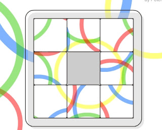
When cropping the circles it reminded me of the puzzle games you see in the above picture. For supporting material for this project, it would be nice to create an interactive app / game to be able to download.
Friday, 24 February 2012
Friday, 10 February 2012
Working space, Posters as a set
Visually interesting to see the graphics as a set up on a wall. The use of cropped shapes and different eye catching colours pop out!
Photographic perspective
These look cool, introducing light and experimenting with angle and perspective makes the viewing more interesting.
Could be really nice to hand print and use photographic parts for the final document?..could be something to think about...?
Subscribe to:
Comments (Atom)


